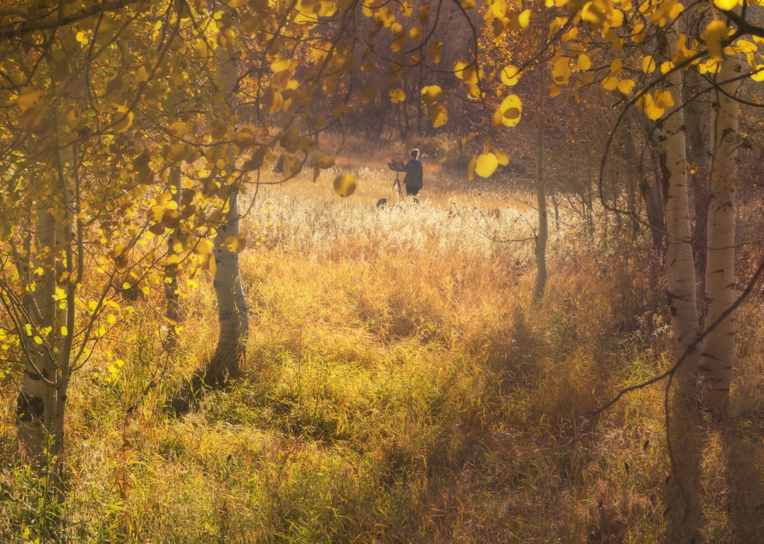
This post is dedicated to everything you would ever want to know about landscape painting, or painting en plein air which is a hoity-toity French phrase for “in the open air.”
Some of you may recall a fun little video I made last year for a competition artist James Gurney hosted with the theme “Plein Air Persistence.” If you haven’t seen it yet, I highly recommend you do so as it is now an incredibly prestigious award winning video.** You can view it here. Shout out to my incredibly talented brother over at Rise Up Productions for all of his help making it. In the video I poke fun at some of the frustrations of painting outdoors.
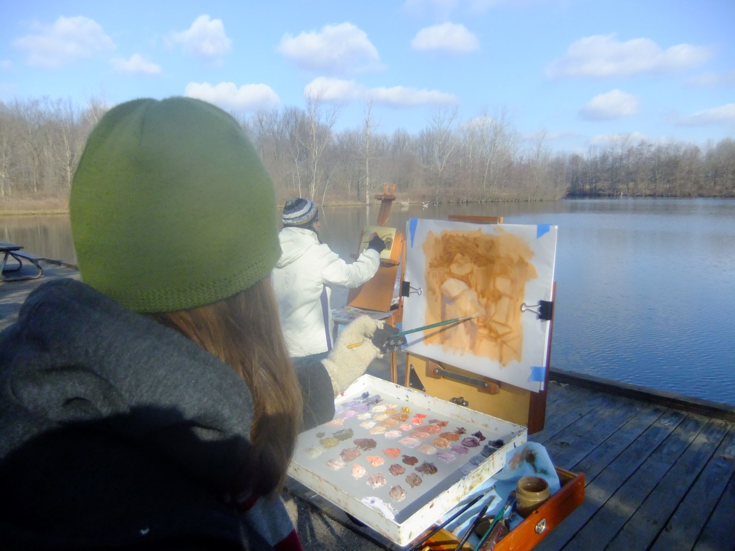
In the nine years I have been painting en plein air, I’ve certainly encountered every curveball nature can throw. I’ve painted in the blistering heat (which led to sun poisoning and severe migraines from squinting) and the freezing cold (where it was so cold in fact that I sobbed as I stumbled back to my car to blast the heat. The sensation returning to my hands and feet felt like a thousand little demons sinking their needle teeth into my red swollen skin). I’ve painted in downpours and gale force winds. I’ve encountered all sorts of wildlife, some lovely and innocent like deer, rabbits, and turkeys and some not so innocent, such as bees and wasps finding the the smell of my paint so intoxicating they nose dived into my gobs of color and rolled in it and, of course, got stuck.
So what’s the point of all of this? If painting in the great outdoors is such a royal pain, why do it? Well, I am so glad you asked.
Why paint en plein air?
In college, I didn’t get a lot of instruction on how to paint. I’m a little (okay, a lot) sarcastic with my initial Intro to Painting class freshman year. I walked into the studio, sat down and the instructor ushered, “There’s the still life, have at it.” Um. Come again?
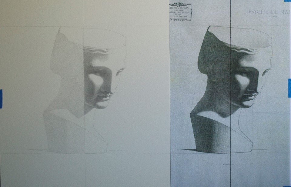
It wasn’t until my sophomore year when I took landscape painting with Neil Riley that my painting education began. Neil taught us that each color has a value relationship. Before going into the field, we spent a lot of time studying master landscape artists and creating value (the lightness or darkness of a color) studies of their work. It seems rudimentary now, but the two things he taught that really helped me initially were 1.) drawing forms rather than lines. This meant not focusing on the idea that I was drawing the outline of a tree but shifting my focus to the forms of shadow and light that gave the tree dimension, almost like fitting all the proper puzzle pieces together to make the picture. And 2.) creating a value scale and assigning each color form a value. Drawing is everything. It doesn’t matter what colors you use, if your values are incorrect the painting will be incorrect as well.

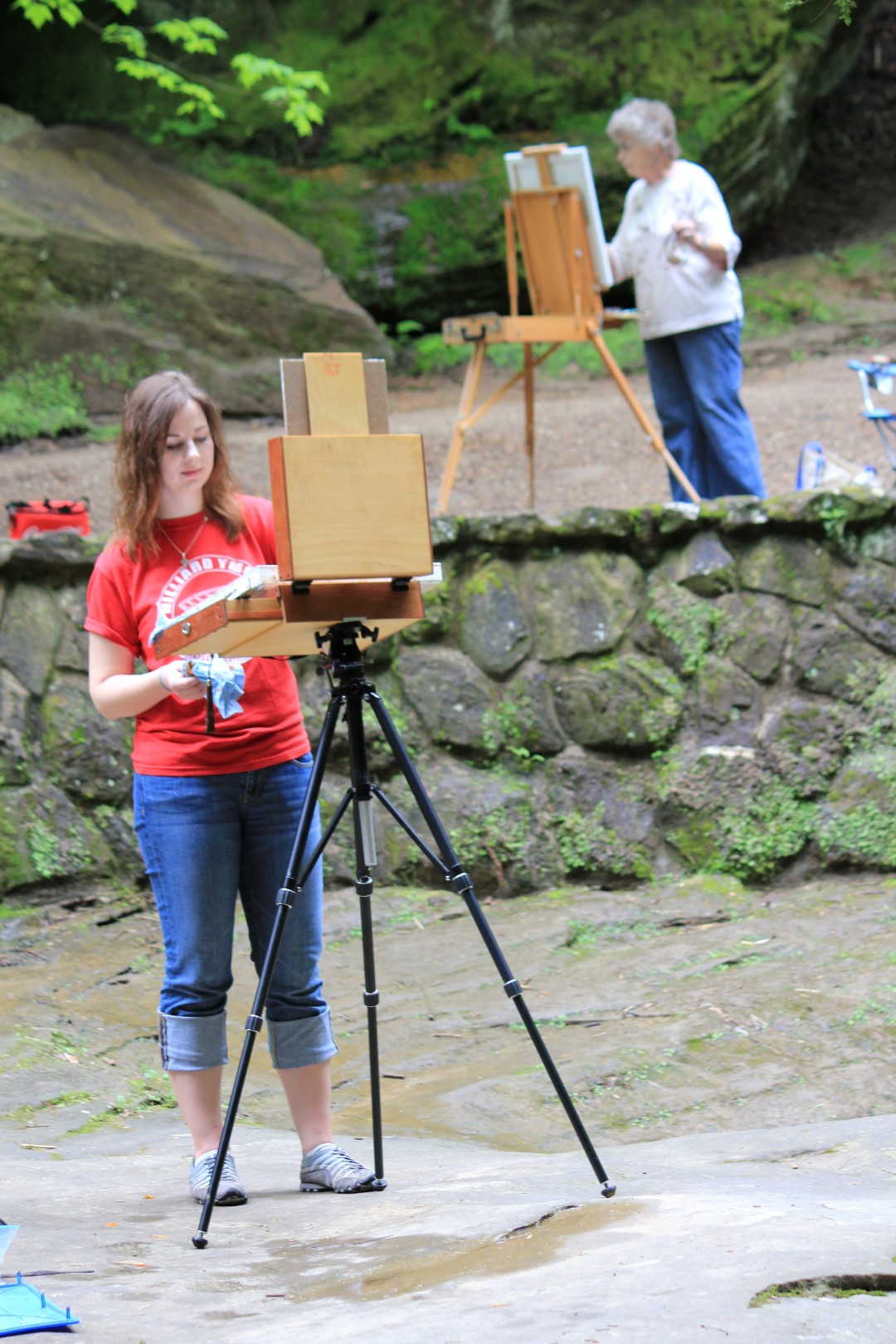
I’m not going to lie. When my class took our first trip outdoors to paint it was incredibly intimidating. There was just so much to see, how was I supposed to know where to start or what to paint? And sometimes the wind would blow and shift the grass and the leaves, was I supposed to paint the grass sideways? And then clouds would come and go, the scene would be bright and sunny one second, and dreary the next…which was I supposed to paint?!
So why paint en plein air? Read the above paragraph again. That’s why. There are so many daunting decisions that need to be made in a snap. If you wait the light will change (and will progressively do so every fifteen minutes unless you’re painting on an overcast day). Painting en plein air doesn’t give you time to over think. You only have to time to act (using what you’ve learned, of course).
My first few paintings in Neil’s class were very embarrassing, but my skill increased rapidly because I didn’t have time to mix the perfect color or paint a perfectly delicate leaf or flower or tree branch. The goals with each landscape painting were to 1.) get the scene blocked in as a whole by massing shapes rather then drawing lines, 2.) establish my lightest light and darkest dark, and 3.) establish the values of the forms.
So what colors do I use?
I was most definitely one of those students who pored over all of my favorite artists works and studied everything they did and used. If they used a certain canvas or panel or brush or color palette, I bought it all. And then I became very confused when my paintings weren’t turning out like their paintings (oh, you sweet and ignorant younger self). Never forget, value is everything! You can never put enough emphasis on your drawing skills. It took me a long, long time to realize this. I wanted to be a painter. So I figured meh, my drawing skills are good enough, I don’t need to focus on them anymore (I’m a slow learner). Now I try to draw everyday. I have a small moleskin that I keep in my purse and take with me everywhere to whip out at every free moment to doodle.
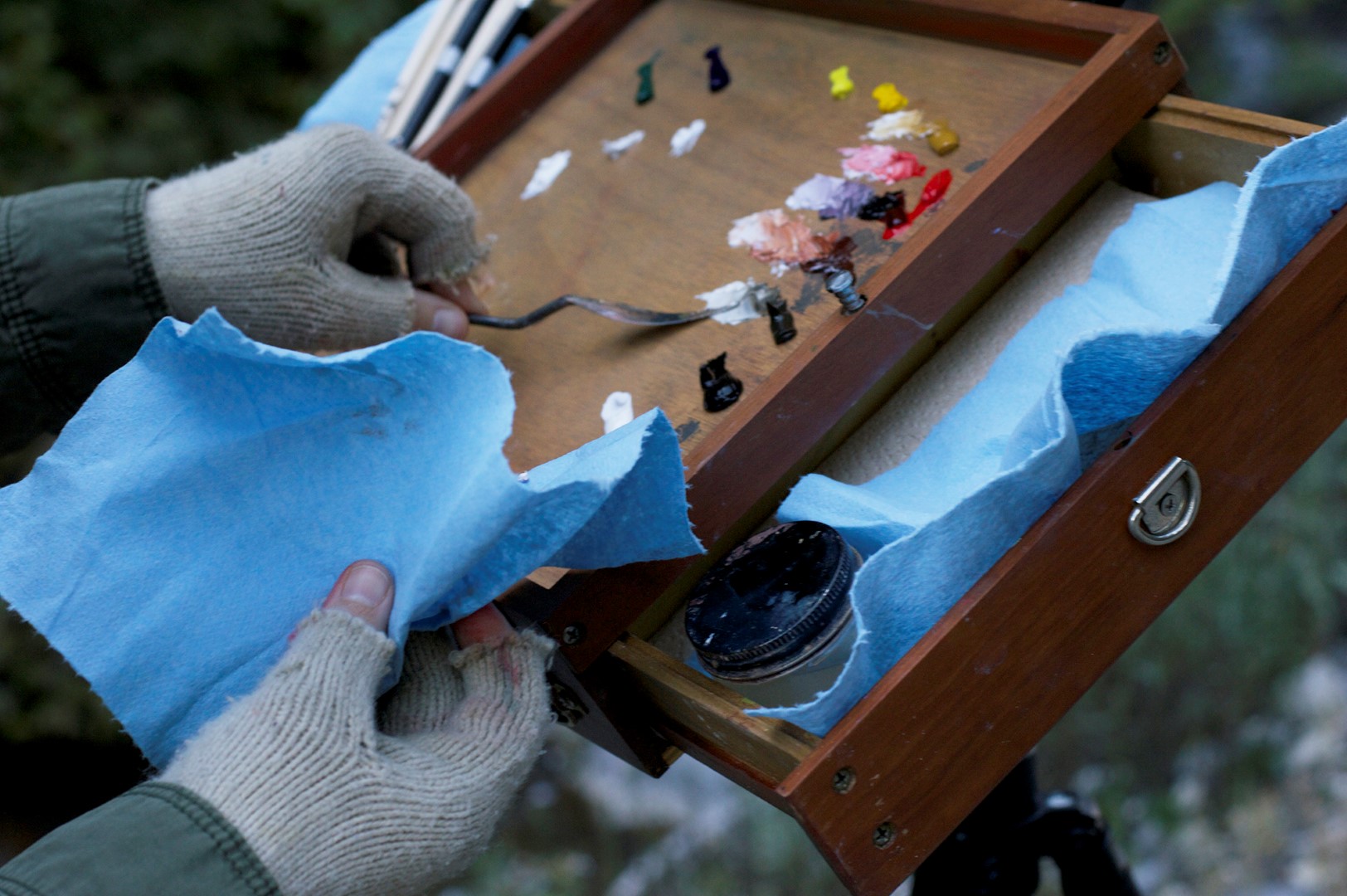
Back to colors. Until you have painted long enough to discover “your palette” there are only three colors you need to paint the landscape: Cadmium Yellow, Cadmium Red, and Ultramarine Blue plus Titanium White (I prefer lead white, but when starting out I would recommend Titanium as it costs much less). Arming yourself with a limited palette is much easier and less intimidating than pooping out a Skittles rainbow.

Sorry, I had to. And notice I didn’t say anything about using black…you don’t need it! Especially as a beginner (nothing in nature is true black anyway). You can mix any and every color with the primaries, and it’s excellent practice to get to know color. So get to mixing!
I will share my palette all the same, because I know you’re just dying to paint like me:
Meghan N. Sours’ Uber Awesome Copy Worthy Palette
(the following are all by either Michael Harding or Gamblin unless otherwise noted)
- Blue Ridge Flake White
- Ivory Black
- Raw Umber
- Asphaltum
- Transparent Red Oxide
- Alizarin Crimson
- Cadmium Red Light
- Yellow Ochre
- Cadmium Yellow Medium (used only occasionally)
- Cadmium Yellow Lemon (used only occasionally)
- Ultramarine Blue
- Viridian
I would like to note that I started out with only a primary palette. I’ve also used the Zorn palette for portraiture (Yellow Ochre, Cadmium Red, Ivory Black, and White) so this palette is a combination of the two, along with a few extra colors that have become indispensable to me. Overall though it’s still a pretty small palette, but with the power of extensive color mixing you can own that rainbow.
What Supplies Do I Need To Paint En Plein Air?
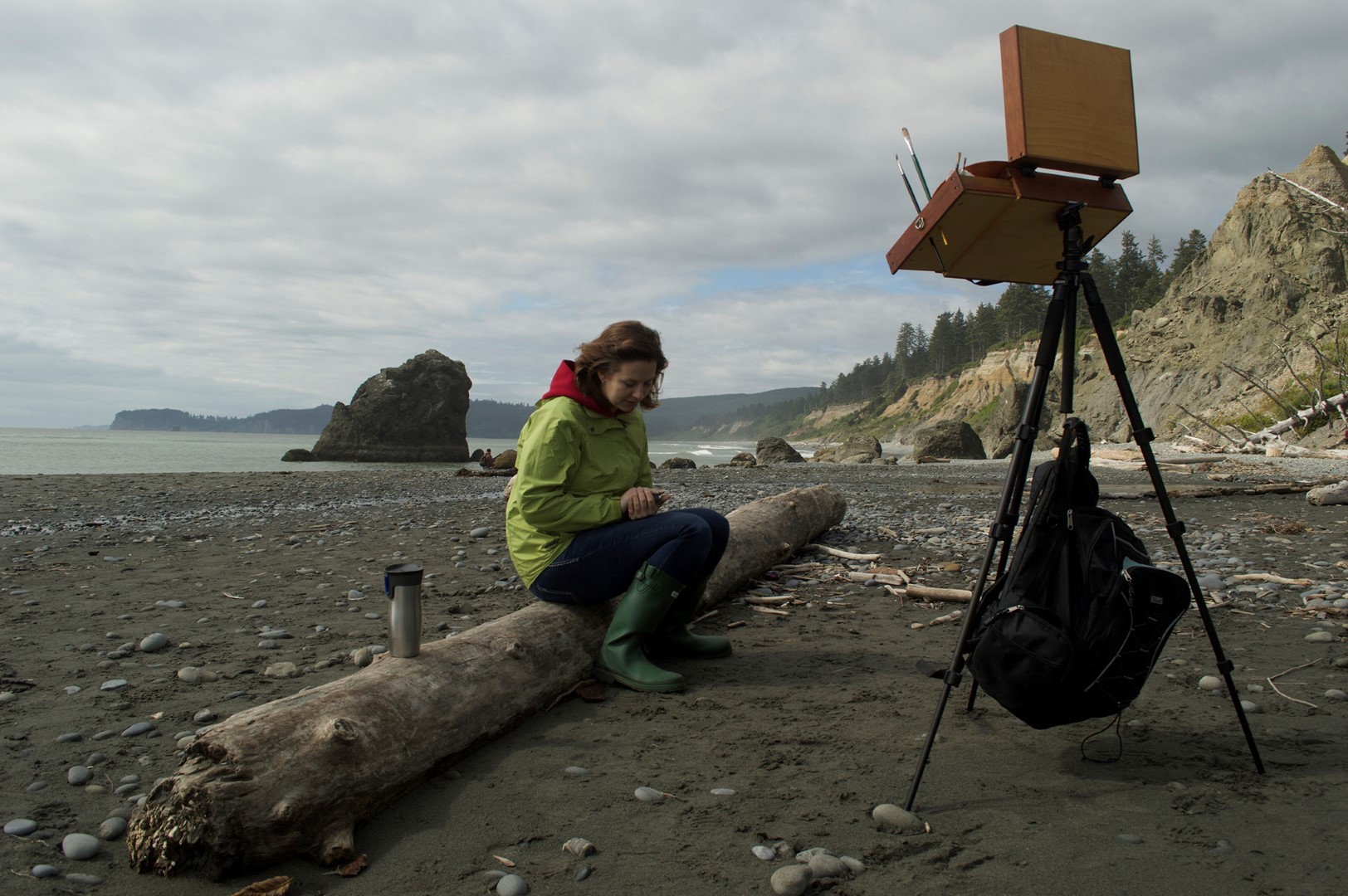
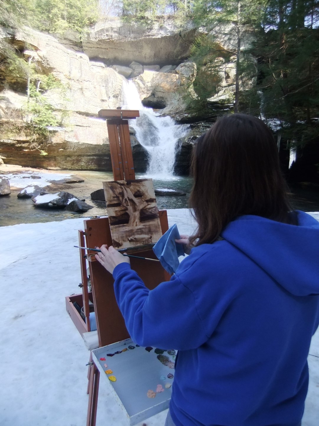
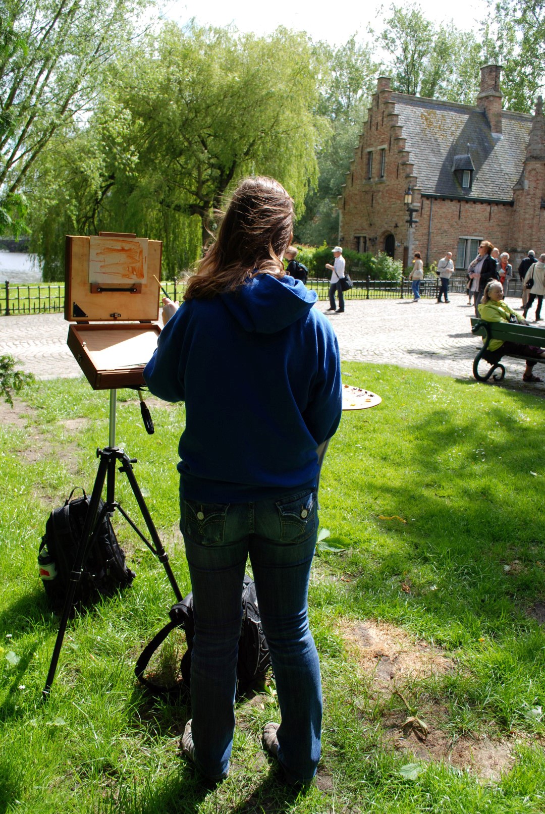
I used to have a French easel and, even though I could whip that thing together faster than a sharp shooter, I got tired of lugging all thirty pounds of it around. For the past few years I’ve been using a beautiful pochade box handcrafted by Alla Prima Pochade. It’s all held together by magnets and is rather ingenious. It’s also lightweight and has a compartment to hold wet paintings. I carry it around in a backpack with my other painting supplies and, when I’m ready to paint, I whip it out, attach it to my tripod and voila! My tripod has a hook on the base. On windier days I hook my backpack to it and fill it with rocks if needed for extra support.
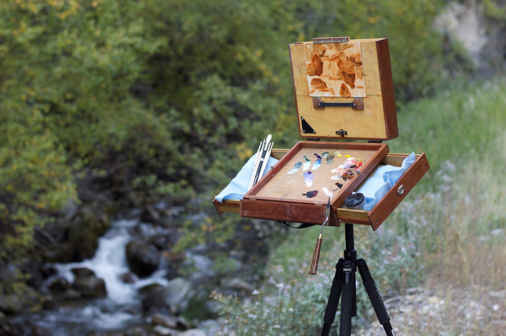
Have a couple of linen panels on hand, perhaps in different sizes. Plan on working small. For landscapes I work anywhere from 4″x6″ to 9″x12″. The best are the L600 series from New Traditions Art Panels.
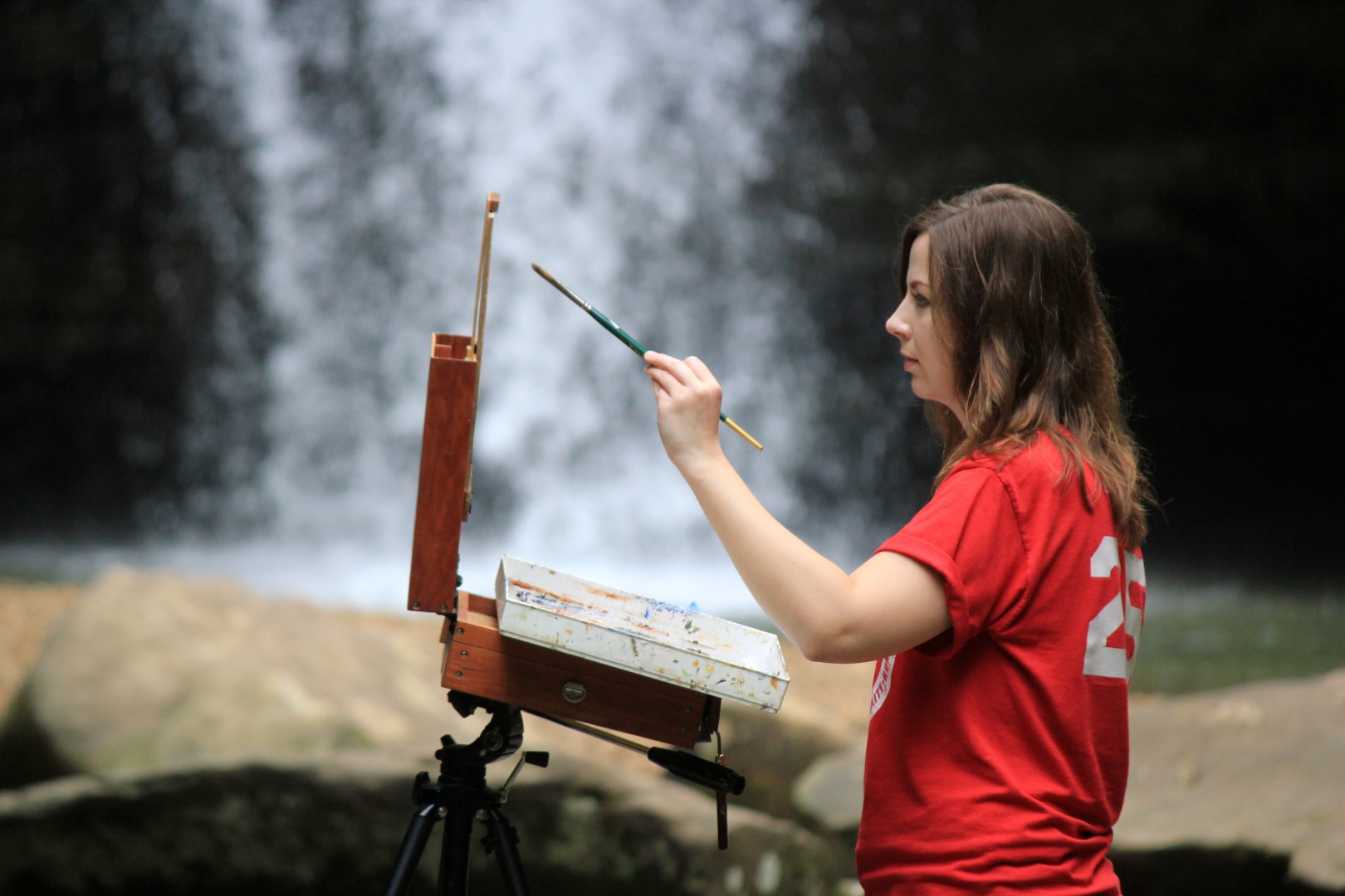
For brushes I use the filbert hog bristle brushes and Legion series from Trekell. I also really like Rosemary brushes, especially the Masters Choice Long Flats. Like your paint colors though, limit the number of brushes you use, otherwise you’ll end up with a fist full of brushes and the realization you don’t even remember reaching for them. I can usually complete a landscape with two brushes, a largish hog bristle for blocking in the scene and a smaller sable (either flat or filbert) for details towards the finish. To keep your colors clean and pure, keep a roll of shop towels on hand and squeeze your brush inside the towel before reaching for your next color.
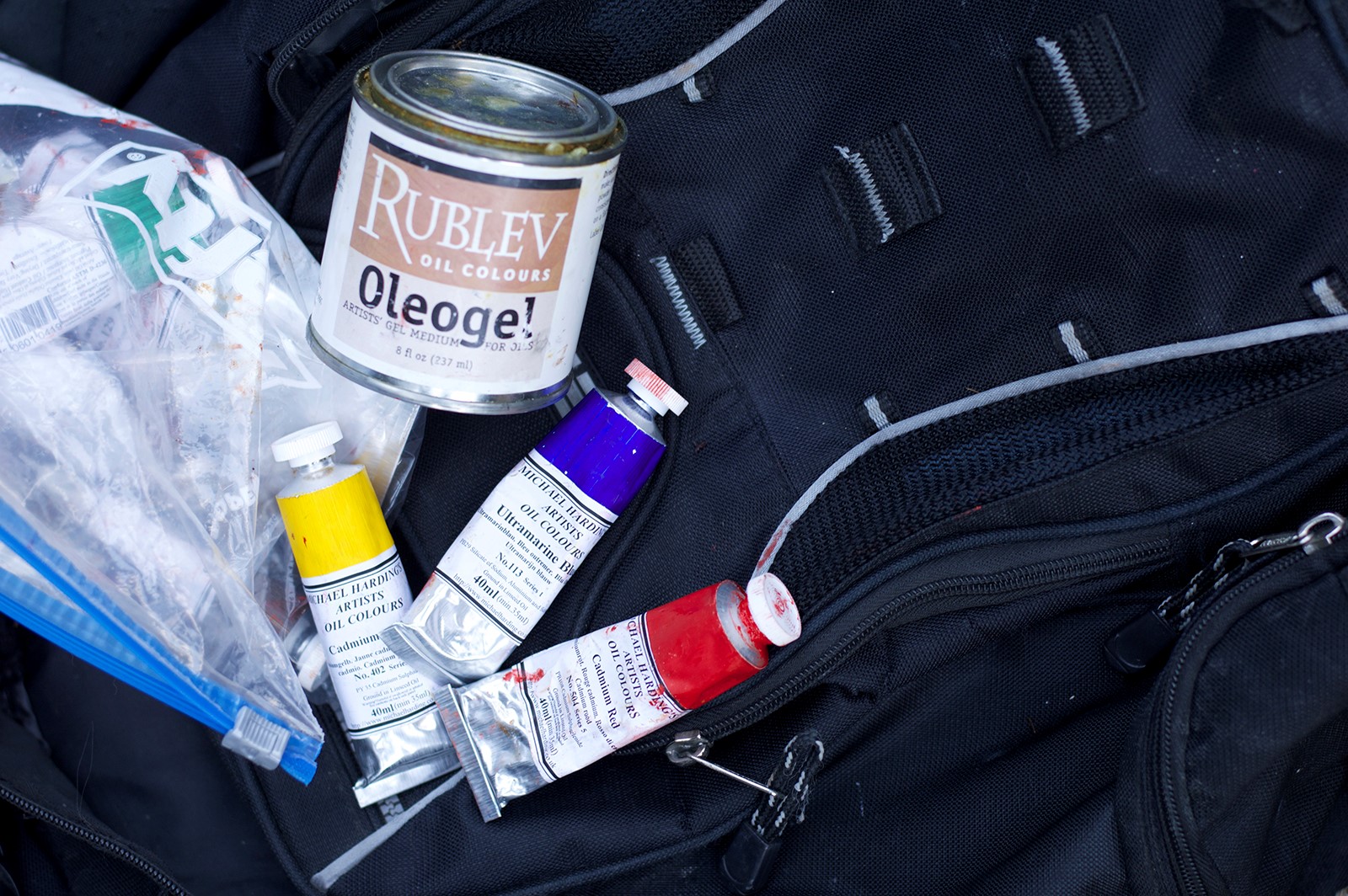
You will also need a palette knife for mixing colors. As for medium sometimes I use Oleogel and other times I simply go over my panel with Gamsol and swipe it with a paper towel before I start painting. I keep all of my paints and medium in a plastic gallon bag just in case they leak. Speaking of bags, it’s always good to bring a couple of grocery sacks to collect trash and used shop towels from your painting adventure.
If you’re feeling overwhelmed and not sure where to focus, use a view finder to set the composition. I made my own in college, which economically consists of two pieces of matboard cut to two right angles. I fit them together with a paper clip which permits me to adjust to the size I need.
This may sound weird, but it’s good to have an umbrella on hand on bright days. You can buy a professional one like this, although I just use an everyday compact one I keep in the car. This helps prevent eye strain from squinting in the sun. You can also judge your colors better when there’s not a glare.
Most importantly, don’t forget to dress for the weather! This includes bringing sunscreen and bug spray in the summer and don’t forget to stay hydrated. In the fall/winter wear a jacket/coat, a hat, and thick socks and boots. I speak from experience…when you’re standing very still painting you will get cold faster. Your extremities such as your feet, hands, and ears will get cold first and will be prone to frostbite. Also consider a face mask or scarf to wrap around your mouth and nose. For my hands I took an old pair of wool gloves and cut the fingers off.
Now you are equipped with everything you need to know to begin painting en plein air. So go. Brave the elements like the bold adventurer you are and experience the great outdoors.
**I came in second place