Here at the Whitaker Studio we started a new live model session. Bill has always been open sharing everything he knows and seized the opportunity to demonstrate some key painting points:

1. Don’t begin a painting by drawing in the lines, because they will become “Holy Writ.” In other words, we as artists tend to grow very fond of the things we draw. We smugly pat ourselves on the back after rendering The Most Perfect Eye Ever Drawn In the Entire Universe even though it was drawn in the wrong place. We will then proceed to create an entire drawing on a poor foundation until the whole thing falls apart (but hey! Splendid eyeball, remember?). If you drew it once, you can draw it again. I used to feel like a failure if I didn’t get the drawing perfect on the first round. Now, I wipe it down and start over like a boss (okay. Maybe the third time around I start to feel a tingle of Woeisme Syndrome). When beginning a painting Bill suggests blocking in big shapes with a big brush. Use patches of color and value to draw.
2. Paint against the form. Marks should be measured, but also fresh and unexpected. And don’t blend the life out of it. Let some of those swishy, scratchy marks show.
3. Use thin washes of dirty color when laying in the drawing. Then use thick patches of clean color to build the form. This is an old master’s trick.
4. Move around! Don’t aimlessly noodle one spot. Paint with purpose. Move around the form. It’s also important to move in front of the easel, or do the “Painter’s Dance.” Bill calls it the “Painter’s Polka.” He says this is how he gets his daily exercise.
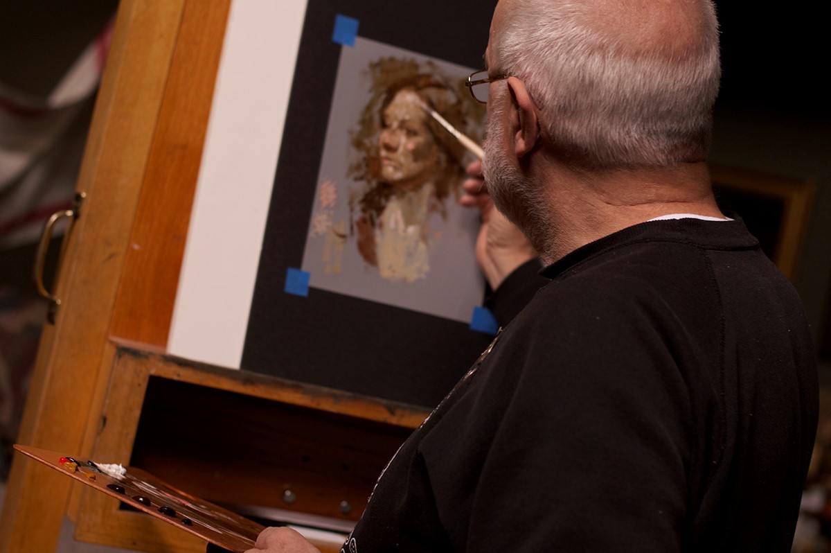
Here’s the completed demo. This was rendered in less than thirty minutes. In the bottom left corner Bill illustrated a boring “Barn Door Painter,” and then showed how marks should be painted.

Bill also discussed not getting caught up in details too soon. He says this is much easier for guys. Girls, on the other hand, just love to get in there and noodle eyelashes. Each mark was made to give the impression of the form, knowing full well it may or may not need altered.
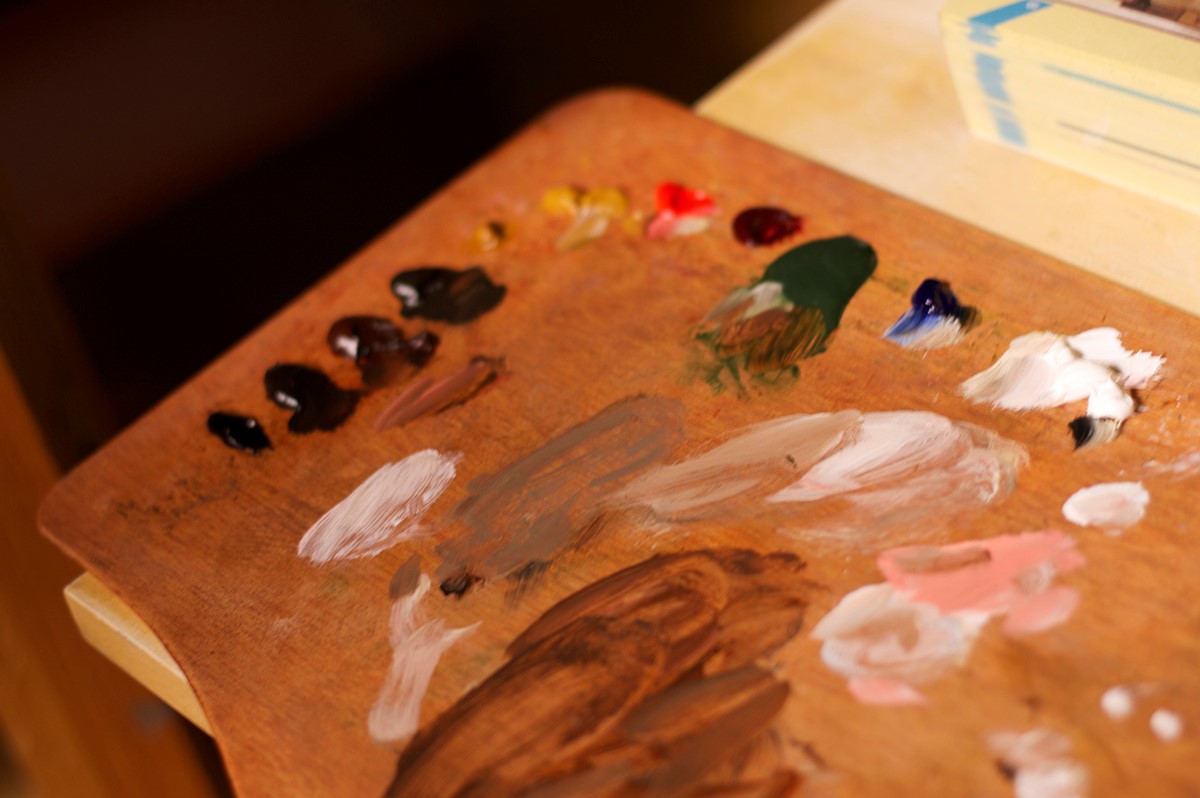
Here’s the palette Bill used: Ivory Black, Raw Umber, Transparent Red Oxide, Asphaltum, Yellow Ochre, Cadmium Red Light, Alizarin Crimson, Terra Verte, Ultramarine Blue, and Lead White.
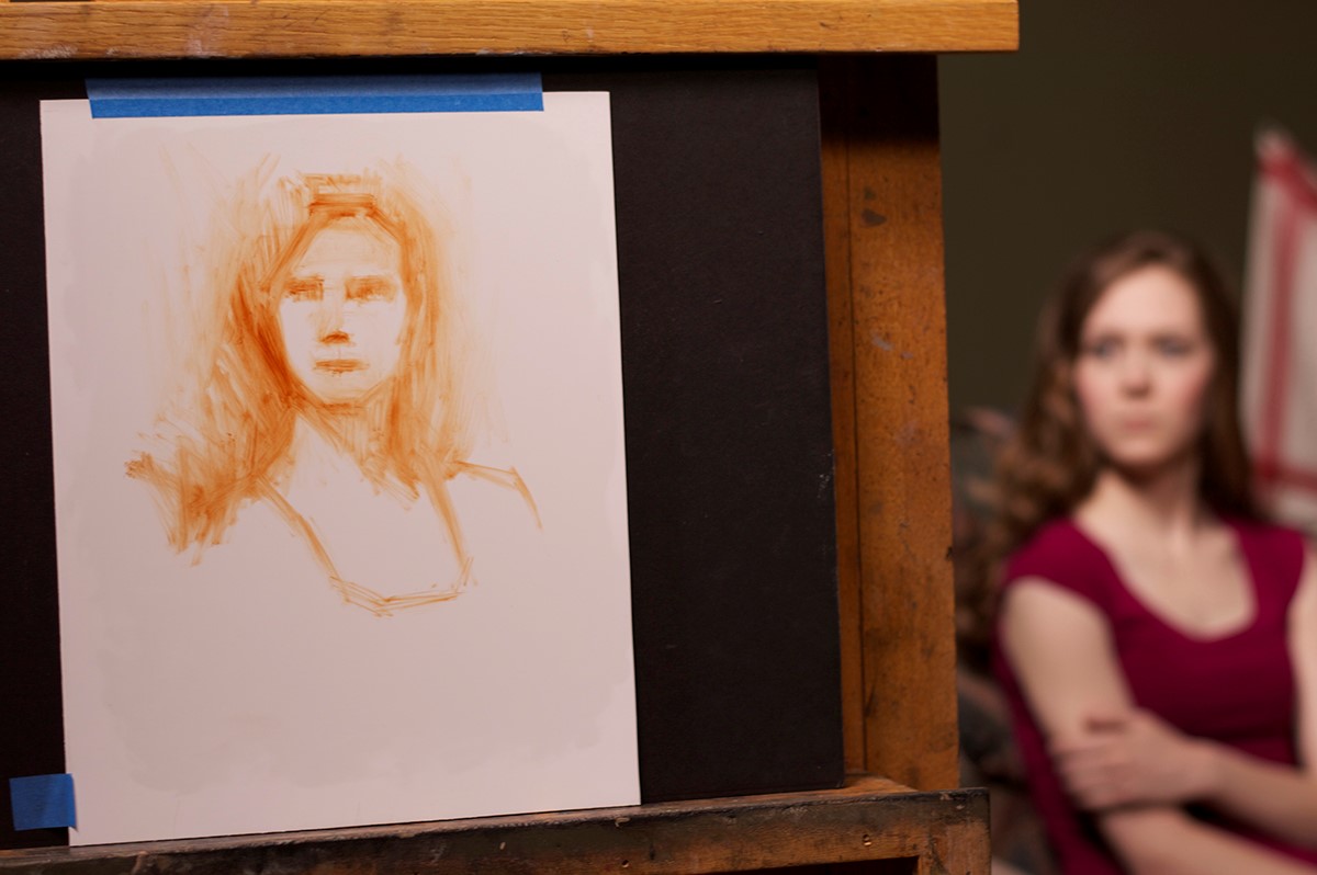
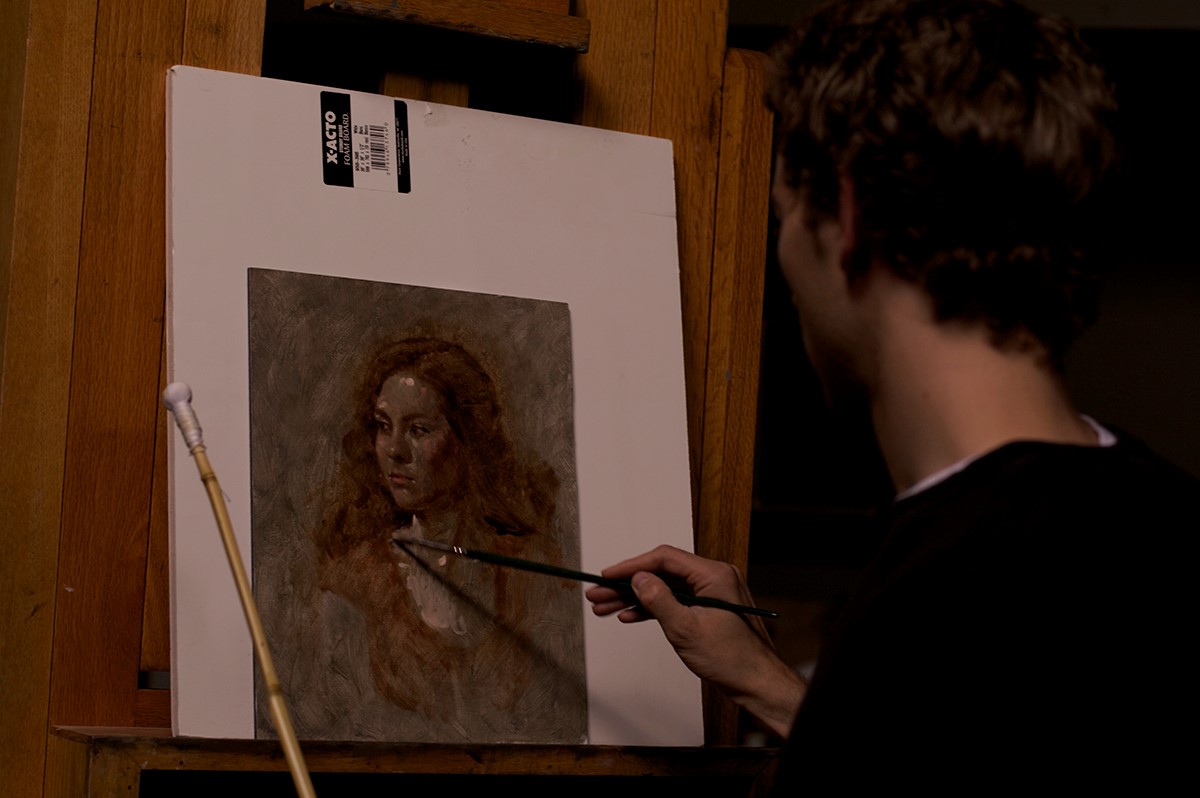
After the demo, it was our turn. Here’s my setup. Our beautiful model, Rachelle, is in the background. This was rendered in the first twenty minute session.
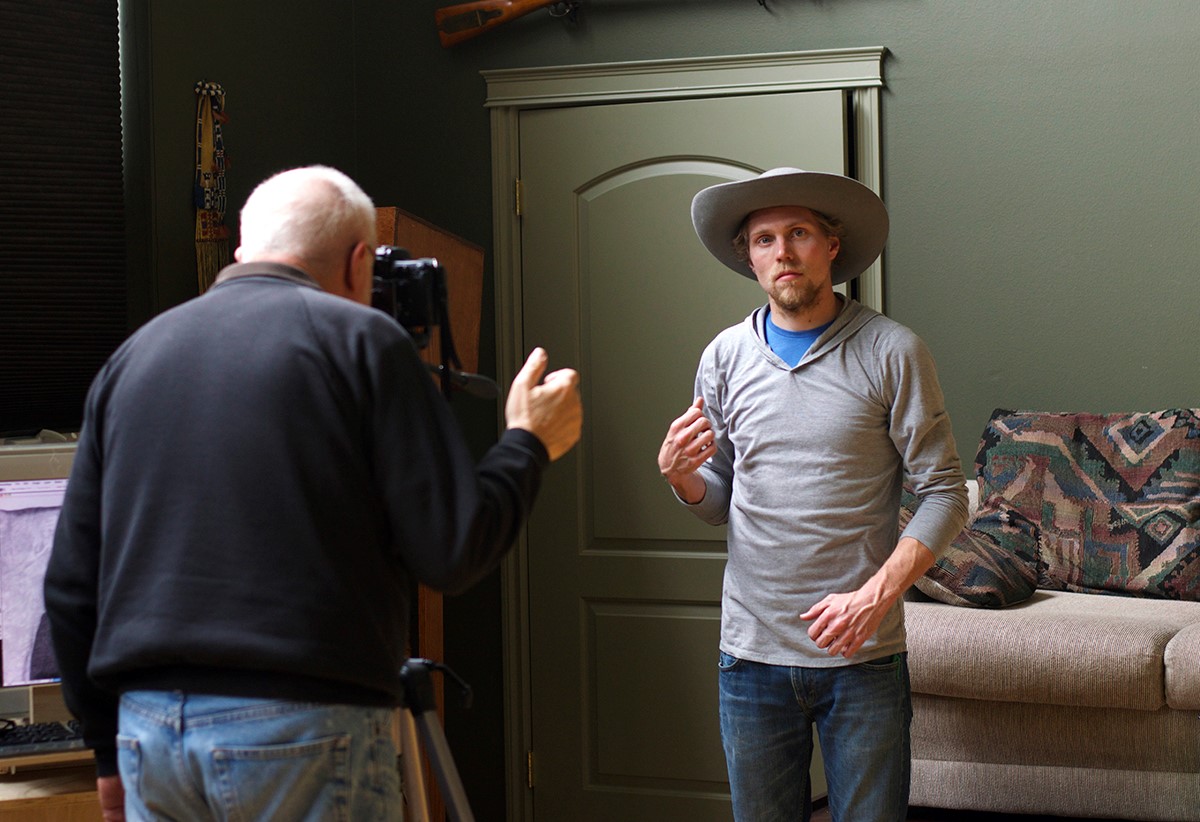
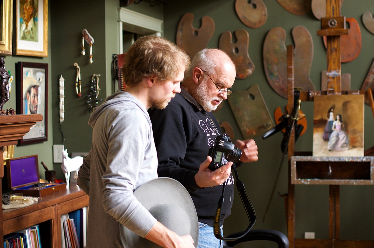
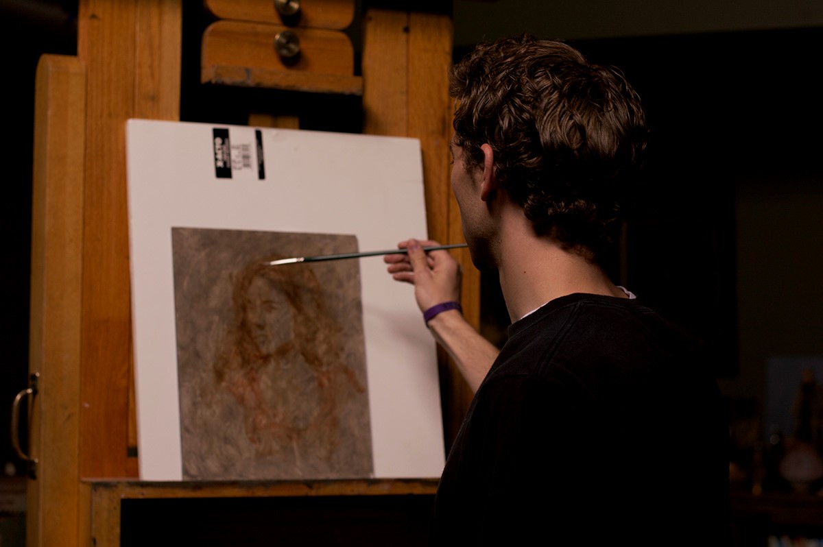
Here’s Brendan’s setup, an absurdly talented student of the Whitaker Studio.
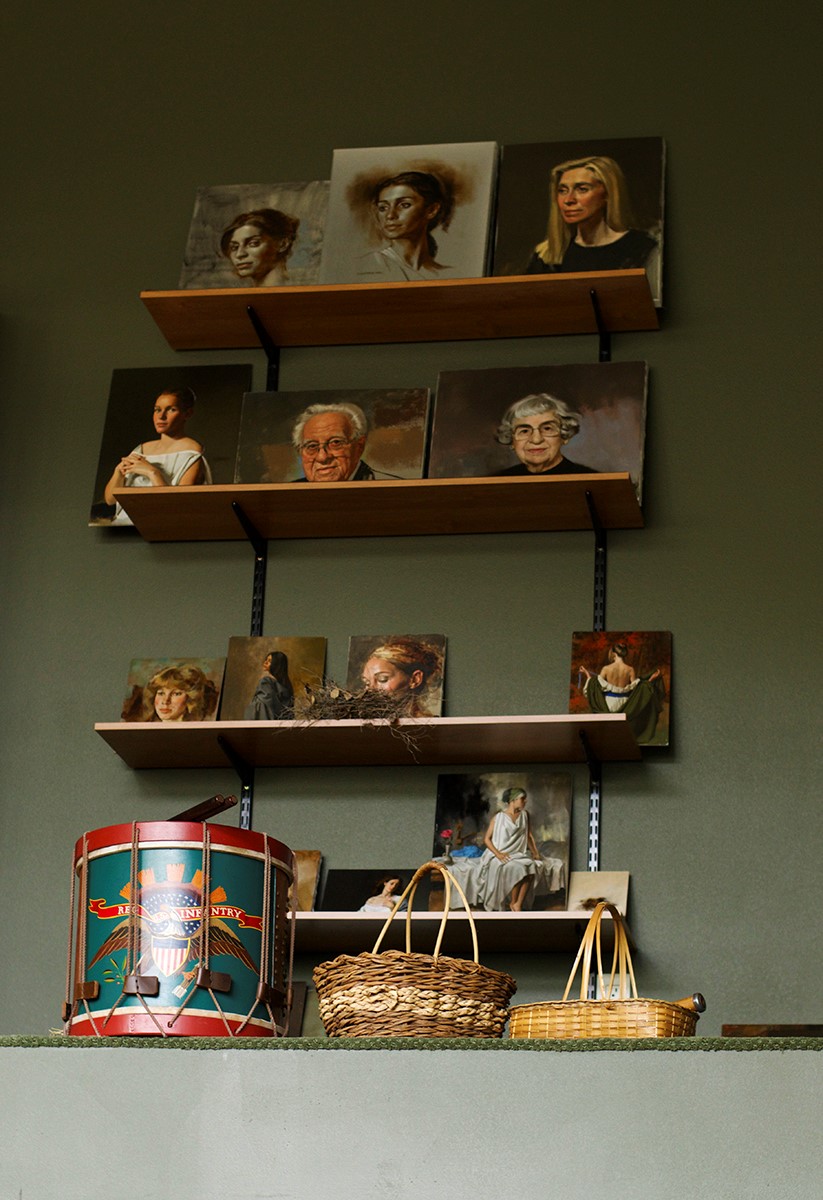
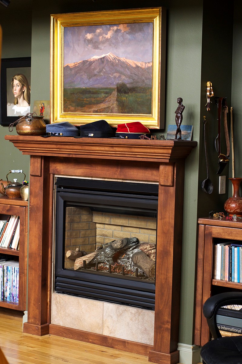
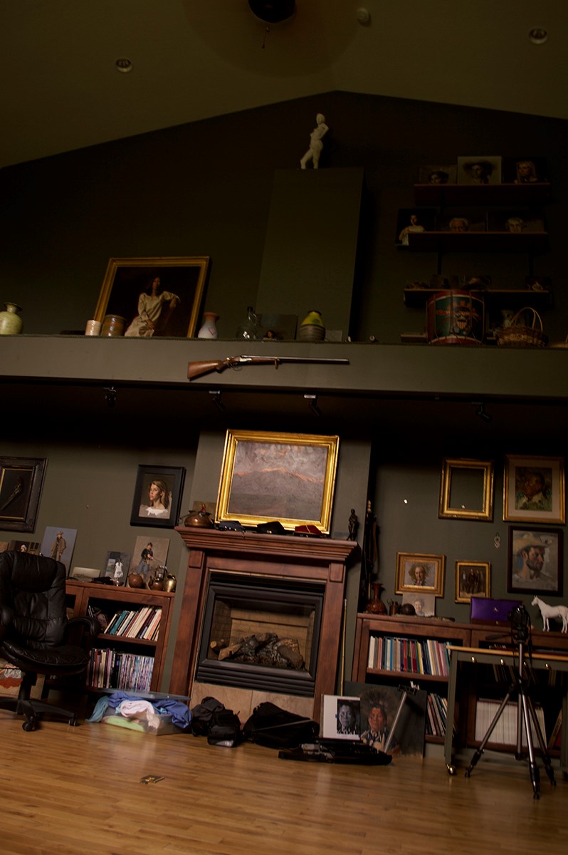
During break, I snapped a couple more photos of Bill’s studio.
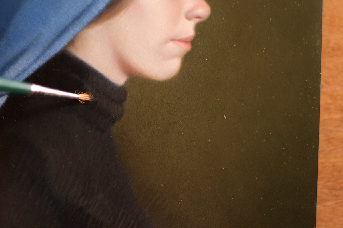
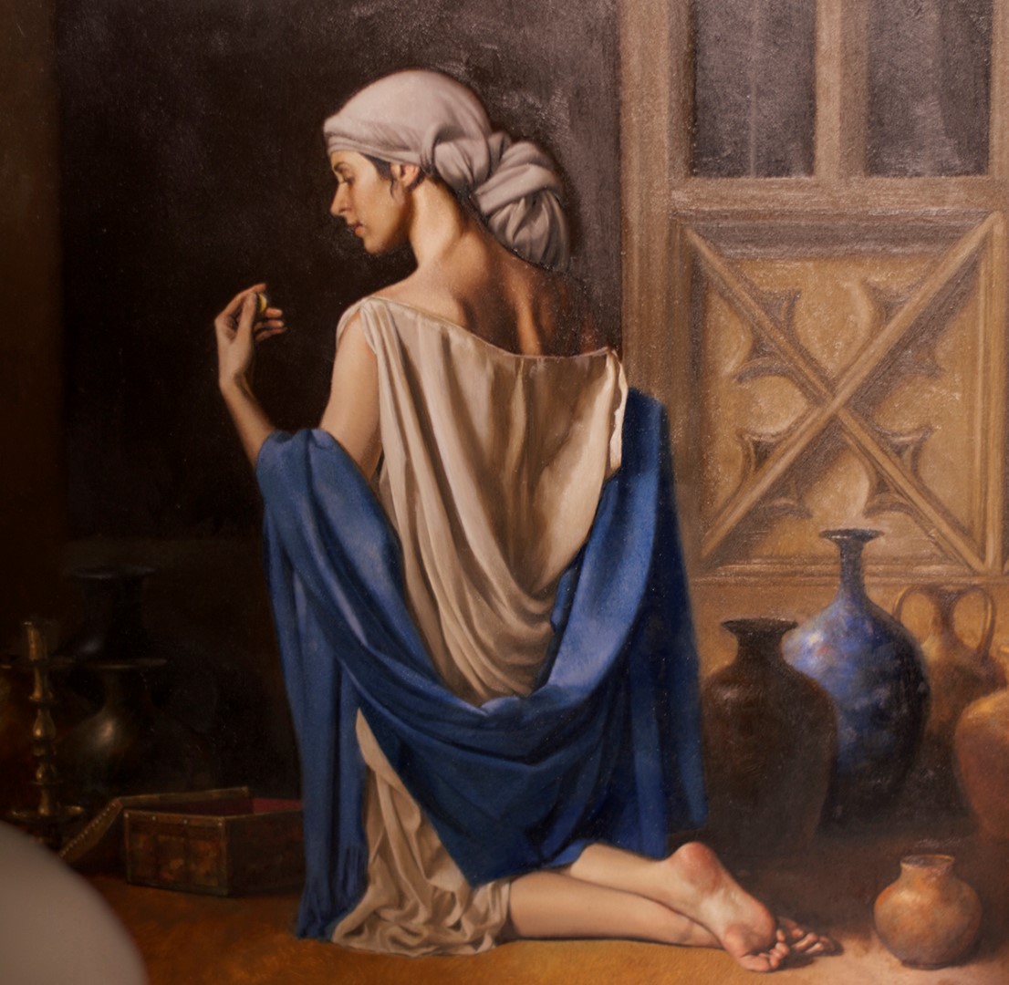
Here’s a detail shot of my current favorite Bill Whitaker painting. Obviously the photo doesn’t do it justice. In life you can see the luminous depth of her skin. He truly is the master of skin tones.
Painting with north light is ideal as the light is constant and does not fluctuate throughout the day.
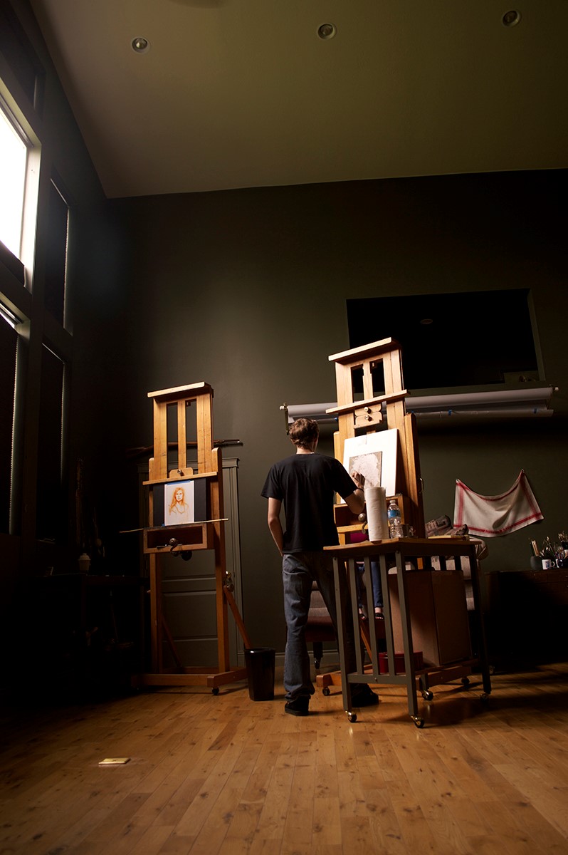
Brendan using clean patches of color.
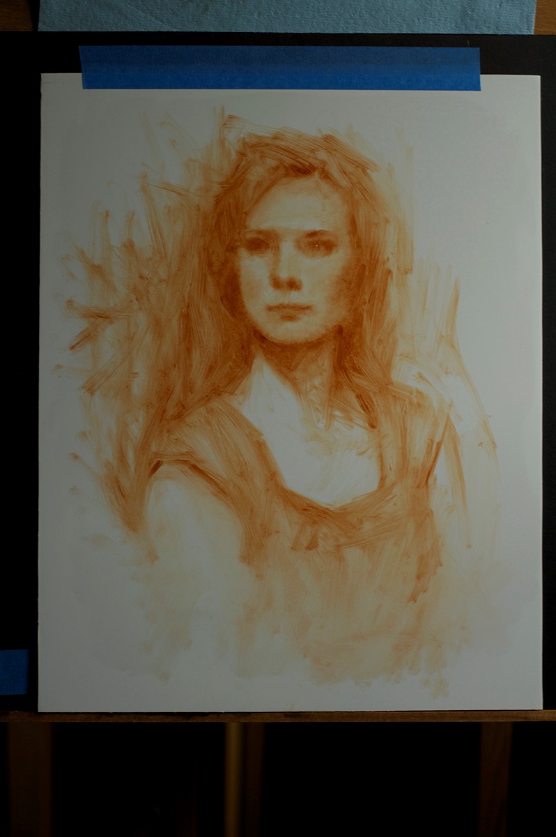
Here’s where I stopped at the conclusion of the day.
Rather than wait on the edge of your seat for this painting’s update, get up and do the Painter’s Polka.